Go Ape Illustration

Go Ape - Freelance Illustration

Go Ape – Freelance Illustration

This was a freelance illustration I produced for ‘Go Ape’ they wanted to create a large board in which families could pop their heads through the holes and become different characters. Taking a snap shot they will always have to keep, not only reminding them of their joyful day at ‘Go Ape’ but adding to the experience.

Homebase Wallpaper

Homebase

Homebase

This was a design I produced for the HomeBase Wallpaper competition. The theme was ‘Scented Garden’. The range included vintage styles, with muted colour palettes and an infusion of more stronger colours like Pinks and turquoise greens. The style is elegant, but has lots of personality. I decided to represent an element of freedom hence why I’ve placed the suitcases in the image and the birds breaking free from their cages. I also made the trees quite swirly as this made it seem more romantic, like a fairy tale forrest.

Update 3.8.13

So I felt it was time for an update, it’s been a hectic few weeks but it’s been enjoyable!

I’ve recently finished university, exhibited my work, graduated, started the dreaded job search and eventually secured my first job in design.

However In-between all of this happening I obtained some fantastic work experience, whilst also staying inspired by visiting exhibitions and viewing some great artistic installations.

So to begin with the work experience was at an independent publishers in the North West, which publishes one of the most popular, monthly free magazines in the UK. During my time there I designed layouts and set type, working and developing my skills in editorial design. The studio was extremely fast paced so it was important to be able to multi-task working on different spreads and advertisements at the same time. This therefore made me realize how important it was to retain a good work-flow, so to keep to tight deadlines. This was a brilliant experience because I got to learn about a different area of Graphic Design.

I still actively seek out exciting exhibitions or things that are happening around my hometown of Manchester. This is one reason I love living in such a lively city because within a short distance are multiple exhibitions, Museum and festivals, enabling you to experience and learn more than you can imagine.

Recently I saw an installation by the internationally acclaimed theatre company, LLotopie, on the waters of the Manchester Ship Canal right near ‘The Lowry’.

The installation was a truly magical experience as the actors drift across the water acting out a thought provoking show. It is definitely something that was not to be missed, merging great story telling, props and pyrotechnics together.

As the installation begins you see normal everyday objects such as a car, caravan and a giant bed effortlessly float across the surface. However as the performance hits full swing the visions of incredible dreams spread across the water creating something that is truly enchanting.  The Theatre company have travelled the world with their ‘Water Fools’ performance and you can see why it has been successful, allowing audiences to experience something they’ve never seen quite like it before.

‘Water Fools’ is devised by the innovative French artist Bruno Schebelin. His creativity is conveyed through his playful characters and flamboyant action packed show, making it truly enjoyable for all ages.

Here is a clip of the show taken in Chicago. The story is the same but some of the props had been developed for the show at The Lowry.

Another interesting exhibition which I recently saw was ‘Creating the illusion: Animation in the North West’ at the Museum of Science and Industry.

The exhibition was all about how Brian Cosgrove and Mark Hall, brought animation to life in the North West. They both met at Granada studies where they created stop frame animation together, not only creating a strong creative bond but also a great friendship.

DCIM100MEDIA

One of their first stop frame films was ‘Sally and Jake’. {Below is a picture of Harry, a puppet from the show). The realism of the Character below caused great controversy, as many people complained because they didn’t like his appearance. There was actually a quote from an elderly lady who had wrote into the company to complain which said “Know one sits at out table in a string vest’ showing how appalled she felt at the puppets appearance and especially how they portrayed it as a normal person sat round a dinner table.

DCIM100MEDIA


The pair worked on many projects together and also attracted young new creators chopping at the bit to work with them and create new ways of entertainment. In the 1970s they were the only Studio outside London to be making stock frame films. Their big break didn’t truly come though until ‘Thames Television’ approached the pair and helped them form ‘Cosgrove Hall’. The first show they created was ‘Chorlton and the Wheelies’ which proved to be a great hit. I took some images from the exhibition of the characters so you could see. (Sorry about the quality). The first image is the main character, happy go lucky ‘Chorlton’. The second is of ‘Fenelia’ the witch who played the baddie in the program, as well as the ‘Toodies puppets who would slide onto the set to save time on animating.

In 2006 Cosgrove Hall reached a milestone when it became the biggest animation studio in Europe, going from employing seven people to, two hundred and fifty. The studio had hit after hit creating programs such as Danger Mouse, Wind in the Willows and the Big friendly Giant, which all won numerous awards.

Paul Berry was also a successor from the studio after being one of the animators at Cosgrove Hall he went on to work under Henry Selick on a ‘Nightmare before Christmas’ and later became Animation Supervisor on James and the Giant Peach.

DCIM100MEDIA

On a personal note I graduated from University a few  weeks ago, which was great closure after studying for three years. I studied Graphic Design combined with Illustration, which taught me a lot. The best thing I found about going to University is that your surrounded by creative people, that will inspire you and also push you to stay on your A game and always strive to do better. I realized how competitive the creative world could be, when live briefs approached the University students would often seek out quiet places to discuss their ideas, so the opposing group couldn’t listen, as well as when we did group critics they would often become more like interrogations. I think that this part of the experience which was although sometimes quite difficult, taught me a great deal, such as there are lots of people that are hungry for it and you have got to put up a good fight to succeed.

DSCF0081

It also however taught me how wrong it was actually for people to behave like this, and even I myself sometimes got sucked into it. I’ve realized over the cause of writing this blog that design should not be hided know matter how good or bad, as it may trigger an idea in you that you automatically just think Genius!  It taught me that to become a ‘designer’ you have to look outside the box, experience and view things differently and embrace other medias and cultures. Look back over history and to also think of the present. I think this is why I do enjoy visiting Museums and exhibitions as I always learn something new or am inspired by something I read or see.

One think that I wish when sprawling through agencies websites is that they show ideas that didn’t quite work, or ideas that didn’t get chosen by the client. After all Designing is for a reason and we wouldn’t be in a job if we weren’t improving upon a service, whether that’s creating a brand to raise more awareness, or redesigning a brochure to make informing people more simpler and effective.

I guess what I’m trying to say is that I’ve come to the conclusion that I’m not going to learn Graphic Design in a classroom, I’m going to learn it through life and trail and error, whilst also experiencing new things.

Lolcat art

A cat-lovers exhibition was recently held in The Framers Gallery in London. The exhibition started when Jenny Theolin tweeted about whether anyone would be interested in participating in an exhibition based around ‘lolcats’. The idea came to mind when the phenomenon of ‘lolcats’ was becoming more and more popular, because of the mass amount of people that share videos online of their cats doing the funniest things. The exhibition included artists such as Lizzie Mary Cullen, James O’Connell and many more. The artwork sold at the event raised funds for the Battersea Dogs and Cats Home.

I really liked looking at this blog as I thought it truly expressed the power of online technology and how rapidly things can develop into an online phenomenon, websites have been made by ‘Lolcats’ fans and even a new language has been introduced by those in the ‘Lolcat community’ of what they believe cats might sound like if they spoke.

Oliver Jeffers

I recently went to a talk by Oliver Jeffers, which was organized by ‘Waterstones’ at The Anthony Burgess Foundation, in Manchester.

Oliver Jeffers is an internationally acclaimed artist, writer and illustrator who award winning picture books include ‘Lost and Found’, ‘How To Catch A Star’ and ‘The Moose Belongs To Me’. At the talk he spoke about his new book ‘The Hueys: It Wasn’t Me’

moose3

At this moment in time, Oliver Jeffers’ work is trending all over the internet. He’s not only popular amongst children but also adults alike. Jeffers dabbles in figurative painting, illustration and picture- book making. In fact Jeffers’ work takes on many forms. He has been exhibited all over the country and won numerous awards. HarperCollins UK and Penguin USA have published his books and shown their support by giving him large contracts to fill. When Jeffers sent off his first book they immediately invited him in to see the rest of his portfolio and gave him a contract to produce ten more books and the rest is history. Oliver worked collaboratively with the studio AKA to produce an animated short based on his second book ‘Lost and Found’. The short film won over sixty awards.


Oliver Jeffers was brought up in Northern Ireland but now has his own studio in Brooklyn, New York.

His talk included him visually drawing on an Ipad which was attached to a projector so everyone could see. He spoke about growing up as a child and how he was always interested in illustrating. He has also travelled around the world and because of this described himself as being obsessed over illustrating maps. He explained that for a long time he search for a world map which included every little place, however he didn’t find one, therefore he drew his own and from then on he drew one for every place he visits, it’s not surprising the amount of tours he delivers all over the world.

mapmisc_9

I love the fact he draws out of enjoyment as I feel you can see this passion throughout his work. Not one bit of it looks laboured, it’s friendly and happy which I feel a children’s book should be. He explained how he’d randomly doodle and draw characters and then one day eventually came up with a story for them. Whilst at his talk a young boy raised his hand and ask “What do you do if you can’t think of anything?” and he replied by saying I move on and do something else. If you concentrate so hard on something it will just make it harder to think of a story whereas if you keep your mind busy doing something else it most defiantly will come to you. I felt like this was great advice as it also keeps you being productive rather than being stuck on an idea for ages and not getting anything done. One thing which I admired about his book is that he hand draws every sentence; I think this is really unique and adds a more personal touch. I also think it makes it more identifiable for children as they can match it to their handwriting. This approach steers clear of the sterile looking text you see on computer screens and Ipads. Jeffers announced that he felt books were not going anywhere and that new technologies had just become another media in which to reach people. He explained that books have been around for centuries and that he felt that they would never go away. A child at night will always like to be read to and be able to enjoy the vibrant pictures that transport them into a dream land.

tpye

I believe in some of his illustrations you can see his graphic awareness by using shapes to symbolise different object, for example, the man in the drumming band. I personally enjoy the simplicity of his illustrations which are quirky but easy to understand.

One of my favourite books in his collection is ‘The Moose Belongs To Me’ as he purchased paintings off street artists and from second hand shops and illustrated over them. The result was a really original storybook with great art.

TMBTM-24-25_F-1

The overall talk was really interesting and light-hearted, appropriate for children that were also there. It proved how someone could take their passion and turn it into a career. I felt really inspired by Oliver Jeffers who showed a bit of determination can pay off. I liked how he had the courage to send his first book off to publishing with not much experience in the field and confidently present himself to land further jobs.


The Picture Book for Adults

Many young children are given picture books as a source of entertainment, as they are growing up. The brightly coloured illustrations capture their attention. As we get older, the main attitude towards books without text is that they are not sophisticated enough or intellectual. Even young adolescences refer to them as childish. The view that most people have of illustration in books is that they act as an aid to help people visualise the text and to help the reader to understand the story better. It is assumed that as we mature, we grow more knowledgeable and therefore do not need illustration to help us understand the text. This is an attitude parents also have, mistakenly thinking that they don’t contribute to the development of their child’s literacy ability.


Educational illustration for childrenEducational illustration for children

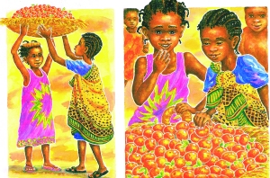
I believe illustrations reflect a lot more things than words can. For example, they tell us what the character looks like, what they wear, etc. They can also show by the way in which they are posed, if they are confident or not. Facial expressions can help to reflect what mood the character is in, in further detail. Illustrations can also reflect various things happening in a scene. However, illustration cannot tell us the finer details such as names, ages, etc nor can it tell us what’s happened in the past or what is planned for the future. For instance, take ‘Handa’s Surprise’ (Browne 1994), we would lose irony in the surprise.  In the beginning, it’s a surprise for Handa’s friends, who Handa’s believes will love her present of exotic fruits. However by the end, it is Handa who is surprised when she discovers that all the different fruits have been replaced with tangerines. The illustrations act towards Handa’s surprise, as the text does not indicate what is happening in the images, without the illustrations the reader is oblivious to Handa’s surprise. The words and images coupled together add to the overall climax of the story. Therefore this is one thing that the picture book sacrifices; it’s the visual interpreter of the illustration, who is the narrator, in this case the child reading the book.

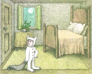
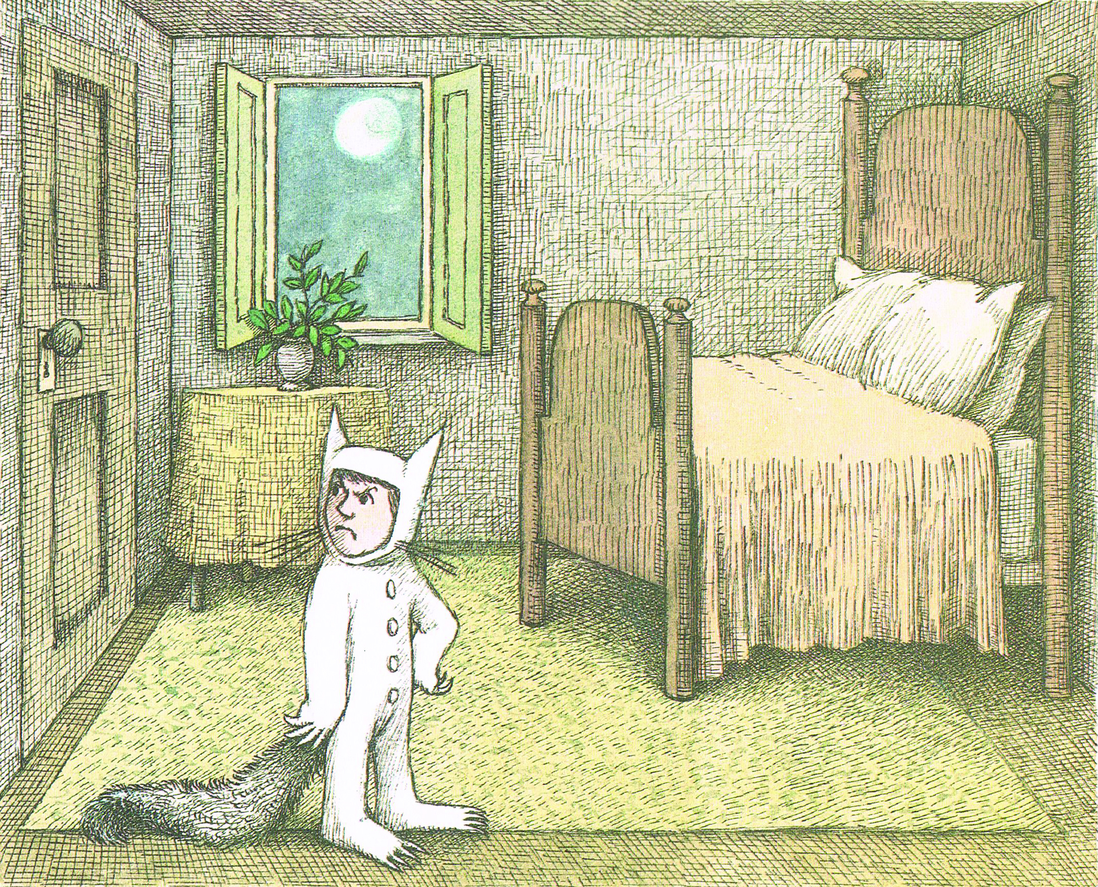
There are no written cues to tell the reader when to look at the illustration. For example in Where The Wild Things Are’ (Sendak, 1970) when Max is sent to bed without any supper the reader will automatically look at his reaction in the illustration. Therefore, this makes the picture book much more taxing than people first anticipate. The child has to take information from the illustration; they have to assess every inch of the image whereas in a book with text you are able to just scan the image to understand what the text is referring to. This teaches the narrator new skills as they have to realise and consider the possibilities of the story. For example, if a child mistakenly interprets an image of someone getting out of bed in the morning, with somebody going to bed, this would disrupt the rhythm of the book.

Educational illustration for children

What adults fail to remember is that in pre historic times, pictograms were used as a purpose of communication by Egyptians and they worked effectively. With the growth in inventions, such as television and the internet, I believe people think that these advanced improvements in technology, mean they are more effective in teaching. However, I believe that people forget to consider that these traditional methods can be used with great effect, as they are able to communicate on a global scale what things mean. For example, the use of pictograms in road signs shows that illustration can communicate to people on many different levels of ability and language.

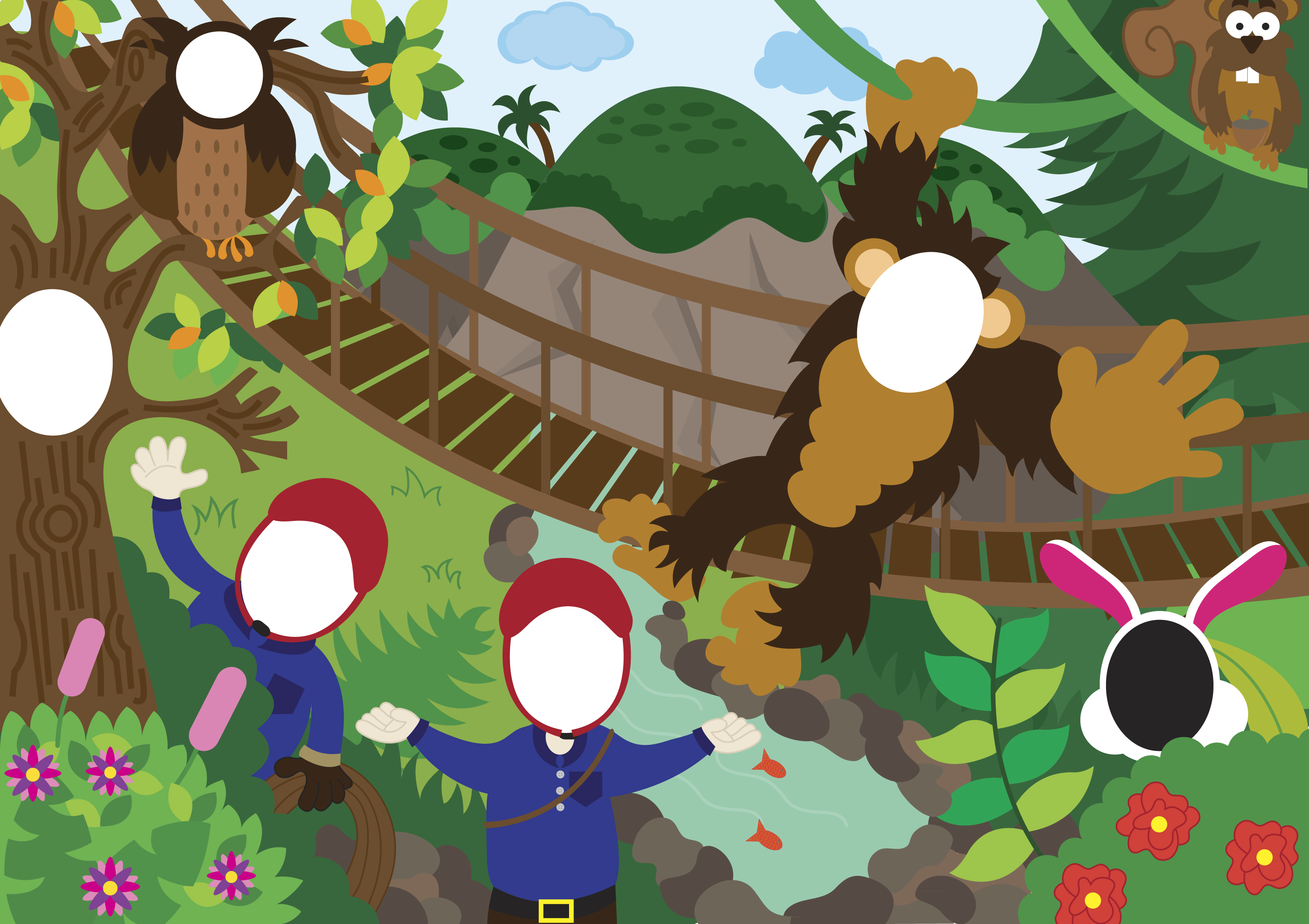
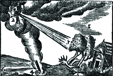
In 1657, the first illustrated book was created; the title was ‘Orbis Pictus’. The principle of what the author was trying to achieve was linking the images and text together for readers to have a better understanding about the various topics discussed in the book.  The picture book, therefore, proved to have a purpose and became the most popular text book in Europe over a century. The quaint illustrations designed on copper and wood helped children learn more easily as they would refer to the images as they read the text. Many people forget that most children are likely to be taught using the ‘show and tell’ technique. For example, a child wouldn’t be able to identify what a table was until they are shown it. Therefore the picture book enhances the ‘show and tell’ technique in many ways. A child was able to understand about an object’s existence and what it looked like even though the child may not have seen the object previously in his / her lifetime. Here is one of the images from the book depicting strong weather conditions, which may have not been experienced by the child. The text is numbered showing which part of the illustration it is referring to, making it very self-explanatory.

Educational illustration for children

Rather than factually educating a child like the ‘Orbis Pictus’ book was used for, picture books may also imply wider social issues such as race and gender as well as individualistic concerns.  For example, in the story ‘Jump’ (Magorian 2002) a young boy watches his sister in a ballet class. He turns to his mother and asks: “Mum can I go to dance class?”

His mother’s response is: “Certainly not. Real boys don’t go to dance class.”

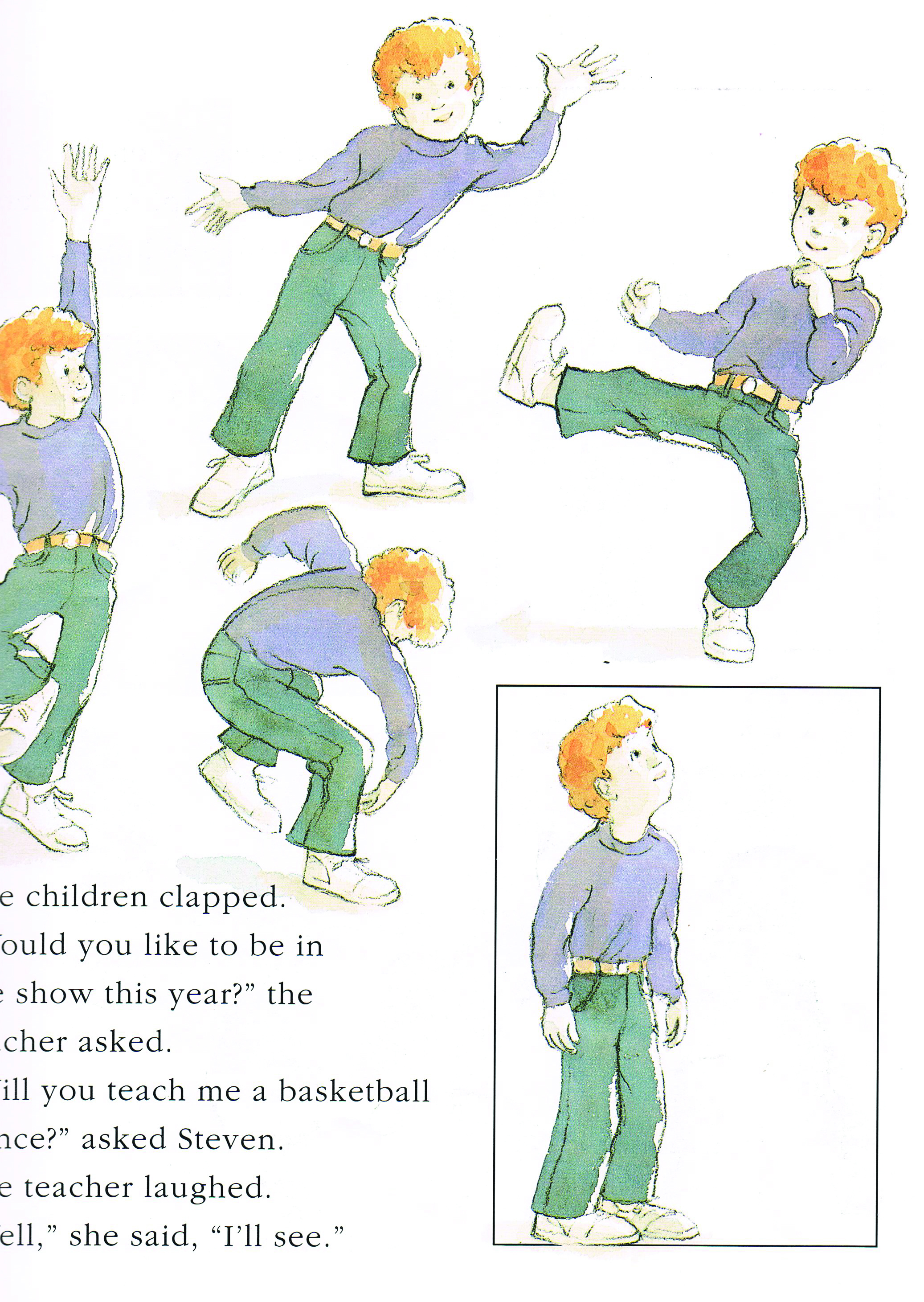
Throughout the story a number of events occur to make his mum realise that he will actually make a wonderful dancer, despite the fact that he’s a boy. The story challenges the stereotyping of genders and what boys and girls should be seen to do. The young boy called Steven is shown through the illustration as energetic and enthusiastic for dance. Steven shows a persistent nature in going against what is deemed acceptable by his mother.

Educational illustration for childrenEducational illustration for childrenEducational illustration for children Educational illustration for children

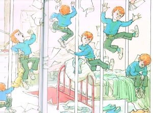
Ormerod cleverly illustrates three double page spreads to share with the reader a vague understanding of the boy in action. In the first spread boys are shown watching basketball on television. This indicates what young boys are seeing as acceptable to play, as it an all male sport. This makes the reader empathy with Steven’s frustration. In the second, you see Steven’s outburst of emotion whilst he is in his bedroom. In the third, you see Steven’s enjoyment as he bounces across the page. The page is action packed with movements reflecting his excitement. The message in the book reflects that boys can dance and should be allowed to do, if they wish.

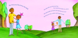
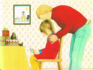
The gender stereotype has always been played throughout children’s literature, as the authors want the reader to be able to relate to the characters in the book. Therefore you tend to see such scenarios as the mother staying at home looking after baby and dad going to work. However, as society is ever changing and the bridge between both genders is getting smaller, authors are forced to expand their perceptions to be able to reach new audiences. An example of this is the story ‘My Princess Boy’ (Kildavos, 2011) written by Cheryl Kilodavis and illustrated by Suzanne Desimone. It is a picture book about acceptance of what normally goes against the norm of stereotypes. She writes to enable both adults and children to act compassionately towards others if they are seen to be different. My Princess Boy is about a young boy who enjoys dressing up. In the images you see the young boy being accepted for who he is by his family. They picture Princess boys older brother in a basketball kit, showing that even though they have different interest they can still get on. The colours a warm expressing how the young boy feels with the support of his family. The characters don’t have detailed faces, however they feel is illustrated through their body language. Overall giving a message that its ok to go against the stereotype if it makes you happy.

Educational illustration for children Educational illustration for children

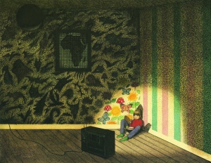
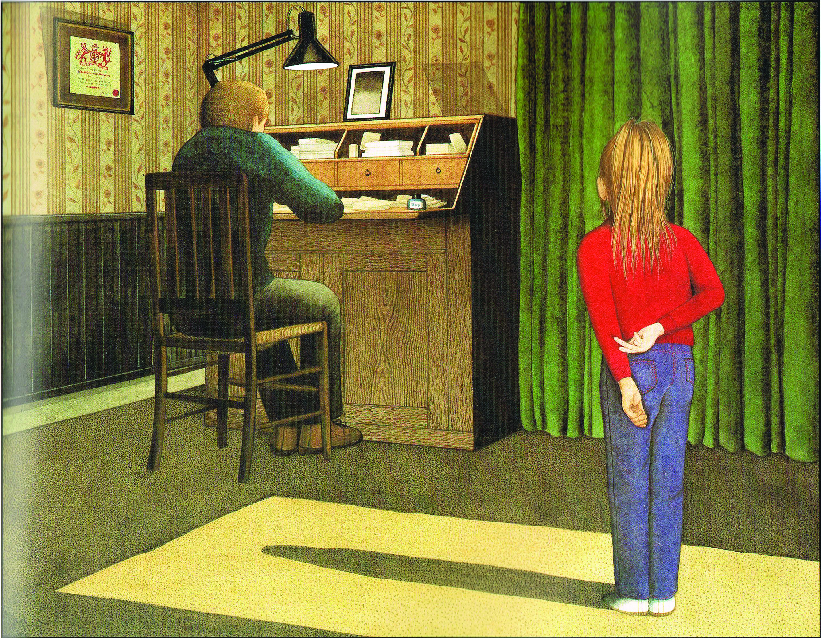
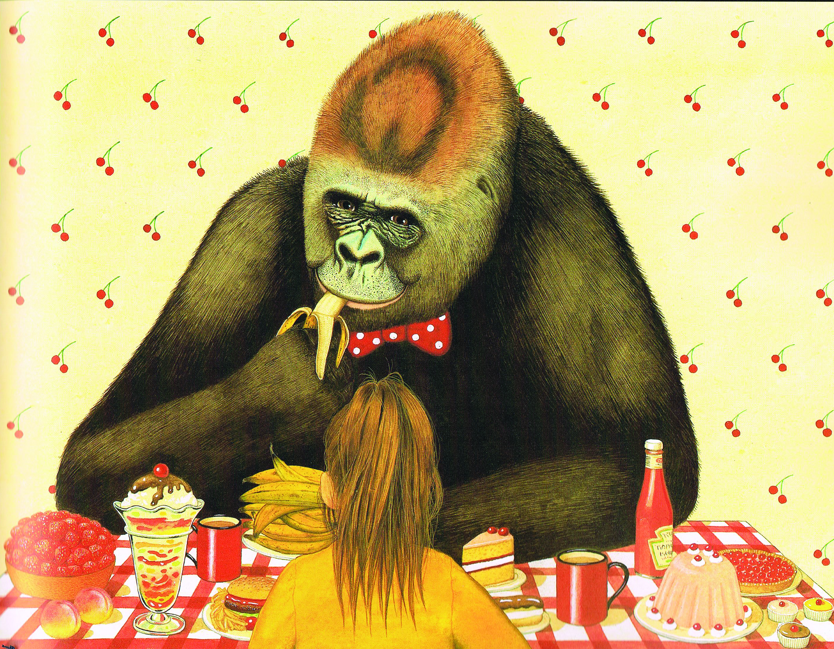
There are many more issues that picture books deal with. For instance in Anthony Browne’s book ‘Gorilla’ (Browne, 1983) the book deals with the parent / child relationship as well as human beings and animals in captivity. The strain between the character Hannah and her relationship with her farther is immediately seen through the illustrations. The colours are very cold blue and grey tones in very angular shapes. There is also substantial space between the characters to make them look as two individuals rather than a family unit. In the illustration, it is common for the reader not to see the characters’ faces; however their emotions are evident through their gestures. As you can see by the tense stance of the body and Hannah’s hands directed away from her fathers in an awkward position. In image 2, you can see Hannah sat on her bed. The composition makes it look like she’s been imprisoned by the bars on her bedhead. The proportions in the image also make Hannah look very small which reflect the way she feels. The third image shows Hannah looking through the bars at a gorilla when visiting a zoo. The image is very sad as a viewer you can really depict the sense of loneliness and entrapment they both feel. When you see an earlier image of Hannah sitting in a corner of a room. She is in complete darkness with just the glare of light from the television. It really depicts the sense of emptiness in her life, without the love and attention from her farther. You also get the same feeling from the close up of the gorilla’s sad face, expressing that humans and animals are not so far apart in emotions. As the story progresses each theme is solved with a happy outcome. Hannah talks to her farther and they begin to understand each other better. Hannah has a meal with the gorilla, in which they both gain a mutual respect for one another. The feelings within the illustrations change dramatically, with warm vibrant colours and nice curved shapes; portraying a pleasant feeling.

Educational illustration for children Educational illustration for children

Educational illustration for children Educational illustration for children Educational illustration for children Educational illustration for children

Picture books for children usually always contain a moral, however what is to be considered is always the same, what is right or wrong?

Many authors that create these books have their own beliefs on the specific topic. For example, Foreman created two books about war, one of which was called ‘War Boy: A Country Childhood’ (Foreman, 1989). ‘War Boy: A Country Childhood’ is an autobiographical account of growing up in a coastal town during the Second World War. The text isn’t fluid unlike many other picture books. There are images such as posters from the war, as well as cartoon style sketches, pen and ink drawings and full colour paintings. The style in which the book is wrote, makes for an informative read on a very serious topic. However Foreman succeeds in lightening the tone, to make the story more suitable for children by adding humorous antidotes such as when he talks about “How to annoy old ladies”. Showing how a young child lived through the war engaged his imagination and telling the story from the child’s point of view makes the adults seem more hysterical.

Educational illustration for children Educational illustration for children Educational illustration for children

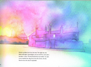
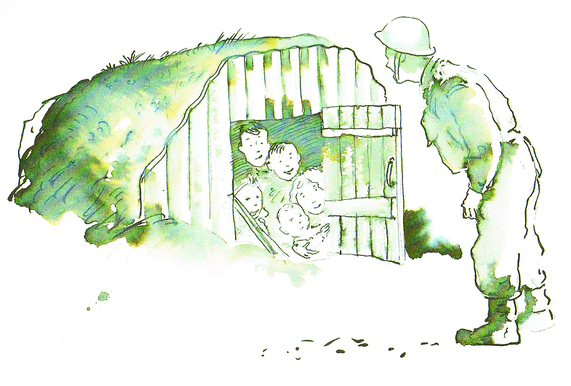
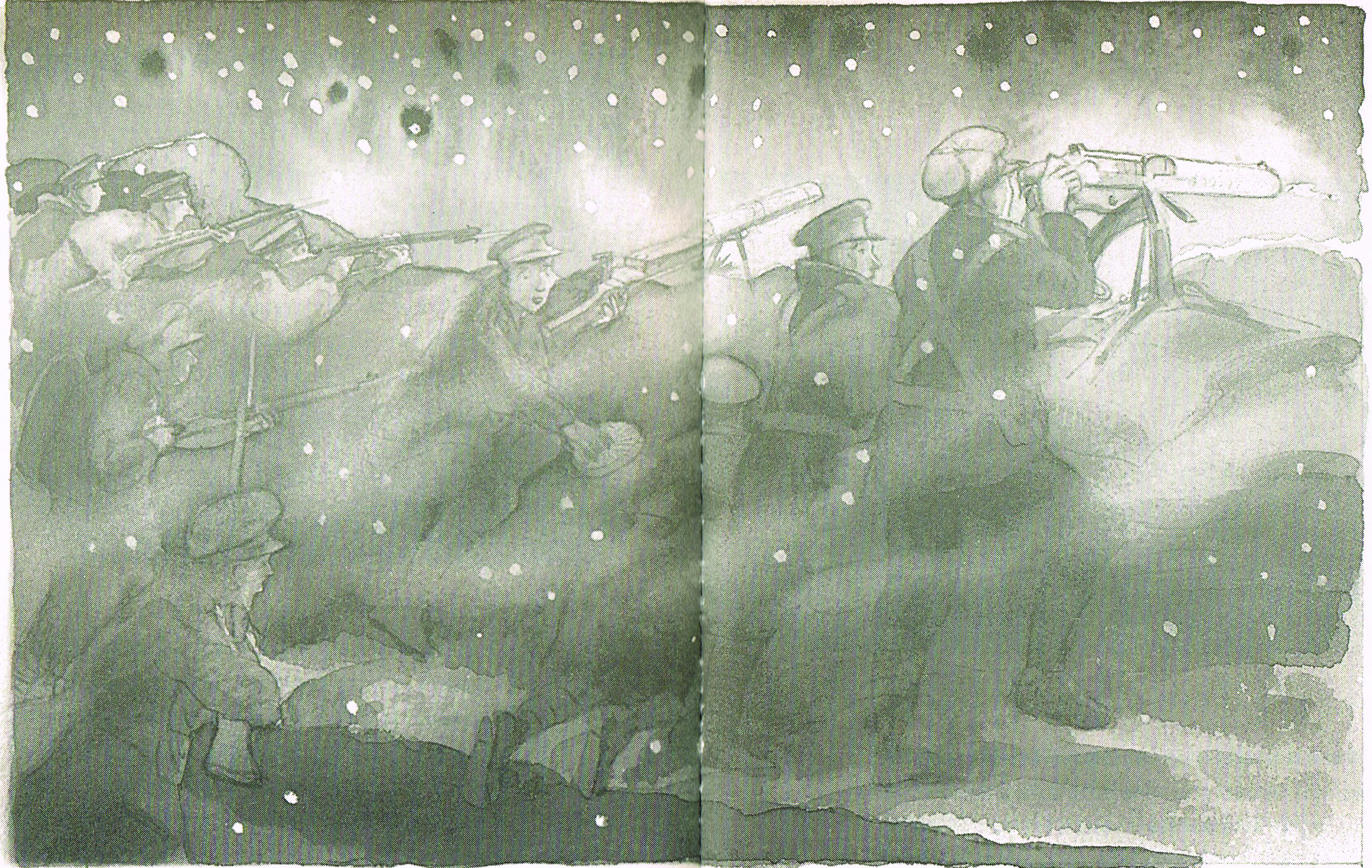
The seriousness of the war is portrayed through the illustrations, enhancing the harsh reality of what was taking place. For example, in the image below you can see the young boy being pushed along by his mother to get to the bomb shelter quickly. The texture of the thick smoke, adds to the drama of the scene, which is furthered by the flowing movement throughout the image of people rushing away from the blaze of fire. The use of watercolour works well as the blotchy area depicts the hazy visual you would see through the smoke, also in contrast by painting quite quickly and loosely the strokes also depicts the panic of the mothers and the pace in which they are running. This book reflected the author’s knowledge about the war and his own experience. His attitude of war is also reflected in his sequel book the ‘War Game’ (Foreman, 2006). The conditions in which the solder fought are graphically depicted with illustrations of the trenches. There is also a section in the book, where soldiers from both England and Germany play football together. This scene is very peaceful and enjoyable both side finding relief, smiling and laughing together. This is in contrast to the images of them fighting. Setting the reader up to understand the devastation that comes next. The last few pages show an English soldier badly wounded and a German soldier dying nearby, again reinforcing the harsh reality of war. The last two pages are wordless; bright red poppies grow through a blanket of snow which has fallen on the ground. The stories and illustrations as a whole, document a time in history.

Foreman reflects his thoughts about war by conveying the naïve thoughts of young men entering the war, upon being targeted by recruiting posters and advertisements at the time.  He also reflects that the young men who were in battle against one another, actually had a lot in common, both sides had a passion for playing football. The impression left with the reader is a fairly horrifying and sad feeling, the book reflects war as being senseless, something that Foreman has a strong view about, having lost four uncles in World War One, he actually dedicated ‘War Game’ to them. Teaching children that with victory, comes great sacrifice.

Educational illustration for children Educational illustration for children Educational illustration for children

Educational illustration for children Educational illustration for children

Overall therefore I believe that illustration should always be present in literature. They prove to enhance the written word. Images are able to add to text by reinforcing what is important, and also reflecting different viewpoints. This helps educate children so they can gain an informed opinion on subjects. Even in adult life when we are supposed to be competent readers. Many texts include images such as newspapers, magazines, advertisements, and maps, even to flat pack diagrams. This shows their diverse use in the modern day.

Sonnie Graffiti Artist.

For my personal project at University I’m including some elements of Graffiti. My natural illustrated style doesn’t include a black line. Therefore making my illustration brights and colourful, as well as very child friendly. This artist really inspired me. I love the geometric shapes and how he makes the most out of the outdoor space. This video was from the Middle Mind Project.

Rob Ryan-The First Cut

I recently visited Manchester Art Gallery to see ‘The First Cut’ exhibition. The exhibition contained over thirty-one international contemporary artists who fold, cut and sculpt paper to make some beautifully crafted artwork.

It becomes the Galleries most popular exhibition, people visiting Manchester to come and see it. The exhibition included a walk through forest, as well as miniature worlds exploding from vintage staple boxes and pages of books.

Flocks of birds and butterfly are delicately placed around the gallery to add a fairytale feel, where guns and grenades reflect artist’s political opinions and economic issues.

My favourite part of the exhibition was the art, which Rob Ryan had created, he used purely black and white which made his work have a silhouette feel. They were so intricate in detail you could look at his work several times and see something new every time. His work is also very personal expressing his thoughts and opinions. I like this as it’s like a trail of thoughts being released in one space and creates for an interesting visual. I also like how he incorporates typography into his work. The type and image fit well together as he uses the same delicate approach. Each letter is carved beautifully from the paper. The time the artwork must have taken is completely worth it for the breathtaking outcome.DSCF0199

David shrigley

I first came across ‘David Shrigleys’ illustration in font bar in Manchester. A quirky cocktail bar thats full of character. Shrigleys art work covers the walls allowing you to sip on a Pina Colada whilst admiring his work. I enjoy Shrigleys work as its very personal. The way in which I would describe it to someone would be an outburst of thoughts and opinions from one individual. Its like seeing an illustration of someones mind and personality. I recently visited the Corner House in Manchester to intrude a little more into his character and life. My first initial thoughts when entering a small room littered with illustrations, plastered all over the walls was that it looked like someone had just been let loose and not held back. I like the honesty of his work. Its humorous, whilst tackling some serious issues. Expressing his everyday fears of the human condition and conventional social matters. His work is quite bizarre at times, but it not absurd because of the issues he does choose to depict. His style making them more lighthearted. Overall I really like the exhibition and his dysfunctional style its very original and uplifting.DSCF0236 DSCF0229 DSCF0227 DSCF0226

David Shrigley

You either like or dislike Shrigley’s work. I don’t think there’s any inbetween. Famous for his irreverent drawing check out this cover he did for ‘Stylists’ magazine. However this isn’t his first cover he’s done. Published over 40 times he reveals at a guess in an article. He discusses his inspiration behind the idea. He admits that over the years as a designer that he’s learnt that people really do judge a book by its cover regardless of the popular sayings and therefore his cover isn’t completely ironic. He also reveals quite proudly that he likes to take logo’s such as the ‘Stylist’ one and Bastardise them. Shrigley admits to sometimes having writers block, however he doesn’t accept it, choosing to work through it. He explains it is hard at times and most things he does during this stage, does get thrown away. He further explains the errors are only because he likes to draw everything once like a true abstract expressionist. His advice for aspiring artists is:

“If you have a vocation, follow it. If you have some art in your head that has to be made, you just have to make it.”