In the 1940’s came the biggest test for Coca Cola. World War two had just began, and young American men were being sent of to fight. Sugar rations were in full swing and the pressure was on Coca Cola to survive.
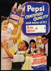
Pepsi was at this time rivaling coca cola with the slogan ‘More bounce in an ounce’. Pepsi was selling at the 5 cent rate, but offering more in larger bottles. It appealed more the mass of people, making it more worthwhile to buy a Pepsi then a Coca Cola. The image ensued a happy and vibrant atmosphere. People, relaxing and socializing over a Pepsi. The copy on the poster looks hand written. This also reflects the pre computer age. In the present day most advertisements copy is done by choosing an appropriate font in professional software. Making for a more easily read advertisement.
Coca Cola new bottles only allowed there to be a lower measure in the glass. However Coca Cola fought back, a few years later with slogans such as ‘It’s the real thing’ sneering at Pepsi as just being an imitator. 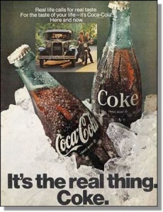
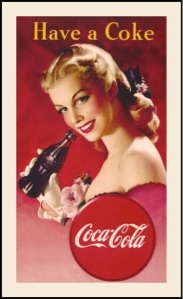
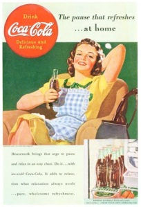
It was also known that people preferred the new Coca Cola bottle. Aimed more towards men it was said to remind them of the female figure. It also was made so it perfectly fitted in your hand. They also came up with the idea of selling Coca Cola in a six pack so it would appeal to women of the household being able to buy bulk making it an essential in every home. Conjuring up images of what being the perfect host was all about. Here is an example of this. The advertising of Coca Cola changed from their previous ads. When the drink was first introduced they used very feminine alluring females, with red lips and blonde hair. In later ads they choose to use women that were more average looking so that the everyday person would be able to relate to them. Here are two examples.The pretty blonde is very sexually alluring, whilst the brunette looks like the girl next door. Not as glamorous but more realistic
Pepsi made considerable attempts in the 1940’s to rival Coca Cola. One main way in which they tried to conquer Coca Cola was appealing to the black community. In the 1940’s segregation was at an all time high. Equal rights had not yet been introduced for the black generation. Many companies never advertised directly to the black community but concentrated on the white American. Pepsi saw the potential in the black market and began interesting campaigns trying to capture their audience. Here is an example of this. The lines are loosely drawn, which sets a friendly feel as there are no sharpe edges. The caption reads “Mmm, Daddy! Now that’s art!” implying that African Americans felt that Pepsi, was the drink for them.
They used artists such as Jay Jackson and Robert Day. Jackson was an African American cartoonist known for his biting satire of racists. His cartoons would have no doubt have got him banned from working at many places during this period, but Pepsi hired him to draw a series of advertisements for Ebony magazine in the late 1940’s. His images were light hearted and humorous. They also had an underlining attitude of mockery towards the simplistic, offensive and ignorant nature of how blacks were represented in the mass media. His images were often made up with black and grey tones, with a simple line of copy. His figures were often drawn curvaceous with exaggerated expressions.
At the time Pepsi management team was mainly made up of white Americans so to could use images of African Americans in a stereotypical way for that time. For example in Robert Day’s advertisement used in the ebony magazine he portrays two African Americans, on an island dressed in minimal clothing and with big lips.
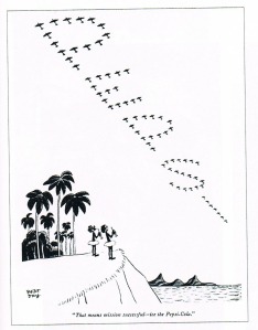
This image at the time was used to try and entice black Americans to drink Pepsi, but obviously could have had a different effect. Mack came up with an advertising strategy to write Pepsi across the skies in America, during the early 1940s. Mack assigned a pilot to write Pepsi Cola in smoke across America. He made the deal that if the words hung in the air for 3 minutes he would pay him. The company used this gimmick in a lot of the campaigns. Here is another example below. The style of Robert Days work was very simplistic. They were line drawings just made up of black ink. They were easy to understand and the people were often portrayed quite humorously. His style was unique and very different to other advertising campaigns at the time. In the image drawn by Robert Day, you can see how Pepsi was trying to change its image slightly. Due to early campaigns such as ‘More bounce to the ounce’ it became associated as the cheap drink. A perception that Pepsi did not like. Day shows in the image below that large ships would have had different decks which would separate the classes of people on the ships. The poster was reflecting that whether you upper class or lower class, if you drink Pepsi then to them you will be seen as first class. The blocks of black are evenly distributed in the image and the Pepsi Cola logo stands out.
In contrast to Pepsi the Coca Cola logo created by Frank Robinson ensued a rich look. The spencerian script handwritten logo made the drink immediately attractive. It made the drink appeal to the well educated person and looked classier. The alliteration of the ‘C’s and ‘O’s made coca cola roll of the tongue and be easily recognizable. Frank Robinson partner of John Pemberton who was the creator of the Coca Cola recipe in 1886 had immediately learnt that the more that Coca Cola was visually seen the more popular it would become. So they placed the logo at every point of contact for a person. They placed it on calendars, notebooks and other everyday products. An element Pepsi didn’t grasp until later years.
Another artist who was quite controversial was Norman Rockwell. During the 1940’s he had often done advertisements for Coke illustrating the American life. Here is an example:
He was known to be an avid Coke drinker and in later years drew a self-portrait of himself with a Coca Cola bottle in hand. Rockwell’s name became synonymous with the culture of simple small time American life. This is probably why Coca Cola approached Rockwell as this is what they wanted Coca cola to stand for. However this was a perception he grew tired off. Rockwell wanted to be seen a ‘citizen of the world’. Rockwell worked for the ‘Saturday evening post’ where there policy was that African American could only be shown in service- industry jobs. Rockwell did what he could to undermine this rule. In the painting ‘Boy in Dining Cart’ he drew a white boy struggling to work out his bill, as a black man smiled looking on.
Rockwell said it took a long time to draw the African American as a individual with a personality not as a caricature. Later in life he chose to work for ‘Look’ magazine as he felt like he had more freedom to draw political themes, specifically race issues. Here is where he made a series of illustration for the civil rights theme.
Pepsi also found out that Pepsi sold most in grocery stores. Pepsi focused on the point of purchase promotion, and set out to find a black family to appear in their next ad. Pepsi wanted to create an image of a black family in the same idealized setting as the coke ads used in their mainstream ads. The main boy in the image was a family friends son of Edward Boyd who was in charge of Pepsi’s marketing at the time. He knew he was handsome looking with a bright and energetic personality. The overall image made up a picturesque scene of a black family enjoying their middle class life.
However even though this was a good strategy used by Pepsi they could not compete with what was going to make Coca Cola the worlds biggest soft drink to date.
In the 1940s many companies switched over to make military goods during the war. Car companies made Jeeps, and clothing factories made uniforms. This however was not an option for Coca Cola, so they therefore had to come up with a different strategy. Their plan came clearer when a young soldier sent a letter home to his wife. It read:
“Well honey, I guess you want to know what it is I want so much outside of you, well darling it’s a bottle of coke.”
A vice president of Coca Cola responded:
“When an American soldier wants a coke it reminds him of what he’s fighting for”
Coca Cola had become a symbol of American culture.
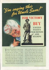
So Coca Cola went to the front line, and was paid for by the war department. Often Coca Cola would use well known war images such as ‘Uncle Sam’ by James Montgomery and interpreted the idea in there own way. In this image you can see the character named ‘Sprite’ designed by Haddon Sunbolm, which was illustrated to simply allow people to recognize the abbreviation of coke from Coca Cola. Here he is shown in the same pose of Uncle Sam by persuading people to make war bonds as a way of helping the war effort.
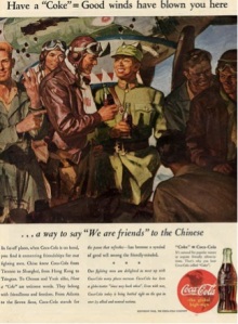
They set up bottling plants near the frontline. The relationship with Coca Cola and the war made the soft drink a symbol of American patriotism. This move enabled them to make important contacts with other countries. This helped Coca Cola reach worldwide success in the future. This was also reflected in their advertising campaigns, For example the image below shows a hand painted image of soldiers talking over a Coca Cola. It became a symbol of good will. Men smiling and drinking a refreshing Coke. Enabling the viewer to think ahead to a prosperous future, showing that things can only get better. The image is hand painted the bottle of Coca Cola sits in the middle intersection of the image showing it’s the main focus. The man on the left is also pointing towards the bottles. It shows that with in all the war and heartache of lost ones that all the men are actually equal and enjoy the same pleasures of taking a break and drinking a coke.
In the future the essence of Coca Cola uniting people and finding a common connections influenced artists such as Andy Warhol. In the 1960s, he described Coca Cola as
“What’s great about this country is that America started the tradition where the richest consumers buy essentially the same things as the poorest. You can be watching TV and see Coca-Cola, and you know that the President drinks Coke, Liz Taylor drinks Coke, and just think, you can drink Coke, too. A Coke is a Coke and no amount of money can get you a better Coke than the one the bum on the corner is drinking. All the Cokes are the same and all the Cokes are good. Liz Taylor knows it, the President knows it, the bum knows it, and you know it.”
He illustrated this by using the repetitive image of a Coca Cola bottle showing that there are no differences between them. The simple use of black and white creates a nice contrast. The limited colours also make the message seem simpler and clearer. The red Coca Cola also stands out because of the white space deliberately left around it.
Coca Cola’s success was in maintaining what was happening to people during that period. Making advertisements, which were easy to relate to. Pepsi tried to appeal to a minority of people, and made bold moves in the advertising world by being one of the leading companies to appeal to the African American market. At the time of which Coca Cola was becoming more and more popular America and England was predominantly populated with white people. Over the years Pepsi has continued to challenge Coca Cola’s lead and has grown to be as big a brand. However immigration has now come into effect and there are now civil rights laws against race. Therefore making advertising companies advertise to a wider spectrum of people. Today we live in a multi racial world, which makes more people aware off, and accepting of different cultures.





You must be logged in to post a comment.